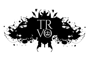
When deciding to refresh my website, I had some specific ideas in mind – specifically the addition of a Rorschach. I love Rorschachs as everyone sees something different in each design. Amy Archibeque and I worked together to create this design and I wanted to know how she found it designing a Rorschach.
– Did you enjoy designing the Rorschach?
I did enjoy designing the Rorschach! It was a fun and challenging project. I always enjoy working on pieces that the client feels a personal connection with, because it’s so much more rewarding when they are happy with the outcome. Working with Alicia and Tanya was a very pleasant experience, and I really love these collaborations when the client and I can work together on coming up with ideas on how to create the image they want.
– What was your process?
For my process, it was important that I started out getting to know Tanya as a client and what she really wanted to represent. I got to speak with her, find out about her style, and see what images she was drawn to the most. We then went back and forth on some mockups in styles she was drawn to. Once we determined a style, I was able to move forward with the logo design.
I started with finding naturally occurring ink blots, specifically in the style of spray paint and ink splatter. With Tanya, we wanted to create more of an edge to her design, so I wanted to use this style of ink, as opposed to the classic water-based medium of Rorschach ink blots. The ink splatter allowed more movement and expression in her design, helping to create a stronger statement. I initially built up a few pieces that formed a crown, then added accent pieces along the edges to help create more movement.
As a rule of thumb, however, it’s always important to step back from your art and get a fresh perspective— as Tanya pointed out, one of my initial designs looked like a raw chicken. And she was right–haha. As soon as I zoomed out and stepped back, all I could see was a cold dead chicken breast with skinny legs. Another reason this piece was so fun to work on was how subjective this piece was– everyone was going to see something different! Obviously, we didn’t stick with the chicken, but Tanya then came back with the raven idea. I worked off a Rorschach piece she liked and used ink splatters again to create movement along the wings and form the outline.
I also had to be mindful of having enough space in the middle to add the logo, so I did have one of the original crown pieces help fill in the middle. It was subtle enough that it could still pass for the chest of the bird, or part of the wings, or whatever one wanted to see.
– What do you see when you look at the Rorschach?
When I look at the Rorschach, I see a woman wearing a crown, with her head tilted down, eyes drawn up. Behind her, a raven has just taken off for flight, scattering feathers, leaves, and other particles in the air around it.
Comment below what you see in the Rorschach!

 +44 (0) 7788 747 946
 “Life is what happens while you’re busy making other plans”.
